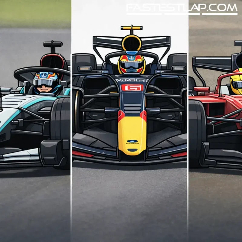
Seven launches into the 2026 livery season and the grid’s already split into two familiar camps: those treating paint as a sacred brand asset, and those using the new era as an excuse to rewrite the visual rulebook.
With four reveals still to come and a brief lull before the next one, the early pattern is clear. Most teams have chosen evolution — tiny shifts in balance, cleaner blocks of colour, a bit of sponsor-driven geometry. But a couple have taken proper swings, and they’re the ones everyone in the paddock ends up talking about because they ask a simple question: in a season where so much is changing, why should the cars look the same?
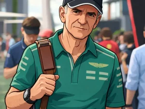
Red Bull and Racing Bulls set the tone by going first, rolling out their 2026 looks at Ford Racing’s season launch in Detroit. There’s an inevitability to what Red Bull does in this department: it’s one of the strongest identities in modern F1, and the team knows it. The interesting part isn’t whether it’s “better” or “worse” — it’s how little it needs to change to still feel current. Racing Bulls, by contrast, continues to search for that instantly recognisable silhouette and palette that survives the TV cameras and a sprint weekend’s chaos. The 2026 version is another nudge in that direction rather than a full reset.
Haas, meanwhile, delivered the most obvious commercial tell of the bunch. Bringing its launch date forward to show the VF-26’s colours, it leaned harder into white and red in a nod to its new title partnership with Toyota Gazoo Racing. In a field where marginal differences can make a car vanish into a pack on broadcast, Haas has at least ensured it won’t be mistaken for anyone else in the midfield scrum. It’s a livery with intent: less “we’ve refined our look”, more “we’ve entered a new chapter”.
Audi’s debut-era aesthetics remain the biggest curiosity, and its latest livery did what good first impressions should — it gave people something to argue about. The finished result nods to last year’s R26 Concept: silver up front, then transitioning into a black-and-red treatment towards the rear, effectively stitching two identities together into one car. It reads like a statement about what Audi wants to be in F1: rooted in the brand’s heritage, but willing to look modern and slightly aggressive while it builds momentum.
Mercedes has played it far safer, choosing evolution over revolution. That’s not a criticism as much as an acknowledgement of Mercedes’ broader approach to presentation — precise, minimal, and consistent. In a way, the 2026 livery does exactly what the team needs it to do: look like Mercedes, photograph well, and let the on-track story provide the drama.
Ferrari, unsurprisingly, has been the one to trigger the most instant reaction. The Scuderia has brought a prominent splash of white back around the cockpit and roll hoop, a move that feels both nostalgic and pragmatic. Ferrari liveries are rarely just “design”; they’re messaging. White can signify heritage, sponsors, even an attempt to sharpen the car’s lines on camera. Either way, it changes the visual weight of the car in a way you notice immediately — which is kind of the point.
Alpine, after teasing bigger “Alpink” ideas in the build-up, ultimately went with subtler tweaks to what came before. Pre-season is full of smoke and mirrors, and liveries can be part of that theatre: promise something wild, deliver something cleaner, keep a little attention in reserve for the first race. Alpine’s 2026 look isn’t trying to dominate the timeline; it’s trying to look tidy and coherent when the car’s actually moving.
So where does that leave the “ranking” debate? Right where it should be at this time of year: subjective, a bit petty, and strangely important. Liveries are the first thing fans get to genuinely judge before lap times complicate the conversation, and this season especially, they’re doing extra work. They’re the first visual anchor for a new cycle — the easiest way to decide who looks like they’ve nailed 2026 before anyone’s even bolted on the first set of tyres in anger.
There’s also a practical undercurrent here. With teams increasingly balancing global sponsor demands, brand guidelines, and the reality that modern cars are rolling advertising platforms, “good” doesn’t always mean “pretty”. Sometimes it means “memorable at 200mph”, or “distinct on a dark broadcast”, or simply “works across digital, merch, and trackside without needing an explanation”.
Next up is Williams, due to unveil its livery on February 3. Cadillac follows via a Super Bowl advert on February 8 — a very on-brand way to announce yourself in the loudest possible room — and then Aston Martin and McLaren are set for February 9. If the first seven launches have been about setting baselines, that run of reveals could be where the season’s visual pecking order really starts to take shape.
Until then, the floor is open — and, as ever, the comments section is where the real championship is won.