Red Bull slaps new horns on Tyneside as Newcastle Falcons become Red Bulls
The bulls have landed on the Tyne. Red Bull has finished its takeover of Newcastle Falcons and wasted no time putting a fresh stamp on the Premiership club, rolling out a new name — Newcastle Red Bulls — and a crest that leaves zero doubt about who’s in charge of the branding department.
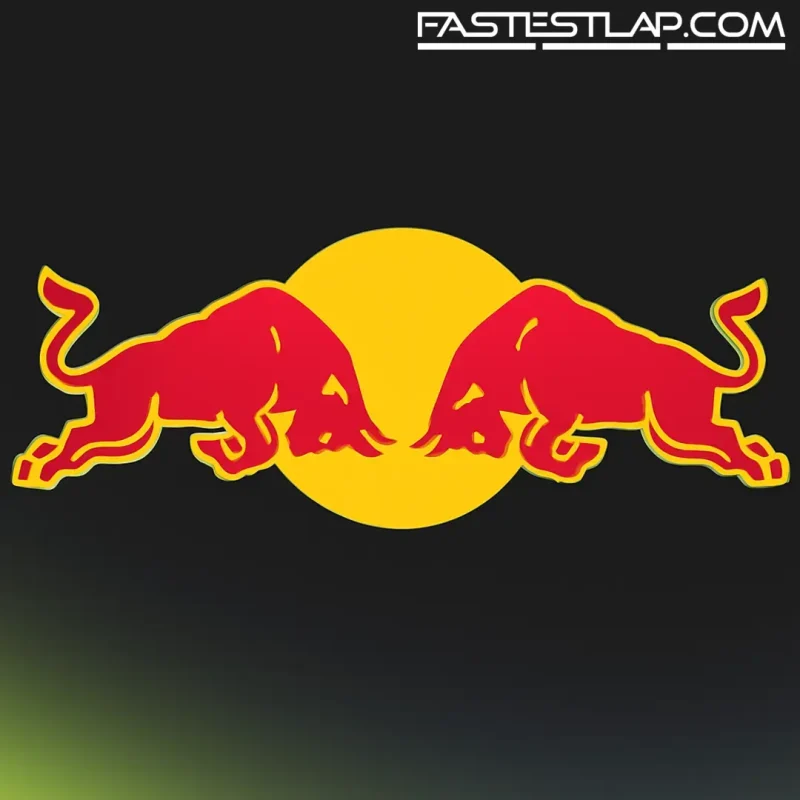
This is Red Bull doing what Red Bull does: taking an old badge, filing off the edges and plugging it straight into the company’s global sports machine. The new crest leans hard into the energy drink’s visual language — deep navy, bold iconography, and, yes, the charging bulls front and center. The club framed it as a reset, posting: “New name. New crest. New kit. New era.”
Alongside the video reveal came a bit of local texture. The badge, the club says, is built around the North Star, a nod to the league’s northernmost outpost and a neat bit of symbolism about direction. The Tyne Bridge arches through the design, there’s a rugby ball tucked in, and those bulls are meant to represent what you think they represent: forward motion, brute intent.
Reaction? Mixed, as you’d expect when a 147-year-old institution swaps a proud bird for a pair of corporate beasts. Some fans called the look cheap and rushed. Others struck a pragmatic tone: if the investment follows, the fresh paint is easier to stomach. That’s basically how these things go with Red Bull. Ask Salzburg.
The kit is on-brand and unmissable — a giant Red Bull logo across the chest, the sort of billboard you can spot from the far stand or a passing helicopter. And the intent from the top is clear. “Together, we aim to elevate rugby to new heights and deliver unforgettable moments for our fans,” said Oliver Mintzlaff, Red Bull’s CEO for Corporate Projects and Investments. “We’re delighted to have acquired Newcastle Red Bulls and look forward to empowering the club to reach its full competitive potential.”
If that sounds familiar to anyone in the F1 paddock, it should. Red Bull’s playbook has been consistent for two decades: invest, rebrand, align the visuals, then chase performance. In Formula 1, it’s underpinned an era of dominance with Red Bull Racing and a sister outfit on the grid since 2006, a two-team model that’s produced world titles, a conveyor belt of young talent, and one of sport’s most recognizable marques.
The rugby move is simply another spoke in the same wheel: football teams in Europe and the U.S., extreme sports, junior series, and F1 at the top of the funnel. The benefit is obvious from a marketing perspective — the same bulls that sit on the nose of a Grand Prix winner now glare out from a stand in the North East — and Red Bull rarely misses a chance to connect those dots when it suits.
Of course, brand polish only buys you time. In football, Red Bull’s remakes have always pulled a reaction — sometimes fury, sometimes admiration for the efficiency — and the Salzburg example remains the lightning rod. Traditional colors and emblems replaced, a new identity imposed, and a breakaway club born from the backlash. Newcastle won’t be immune to those emotions, even if rugby’s ecosystem is a different beast.
From a motorsport vantage point, what’s interesting isn’t whether the crest works. It’s the scale. Red Bull keeps widening its sporting footprint while F1 remains the tip of the spear. The company’s success on Sundays gives credibility to projects like this on Mondays; the projects, in turn, keep the brand omnipresent. That flywheel has been spinning since the mid-2000s, and it’s still gathering speed.
So what changes, practically, for the Red Bulls of Newcastle? Short term, it’s a logo and a kit and a new sign above the door. The bigger test sits on the pitch: investment in facilities, staff, pathways, and the competitive step that justifies the shake-up. Red Bull knows how to build performance programs. It also knows the scrutiny that comes with it.
For now, the club has its new badge, its new identity, and a very loud promise of a new era. The falcon has flown. The bulls are charging. Whether Tyneside takes to it will be decided in wins, not fonts.