Red Bull’s new bull: subtle logo tweak hints at bigger shifts for the Ford era
Red Bull has quietly rolled out a refreshed team logo ahead of F1’s 2026 reset, a small visual nudge that carries a lot of meaning as the team prepares to build and race its own power units with Ford.
The update won’t knock your socks off at first glance. The charging bulls and the core wordmark stay put, but the “Red Bull” lettering now wears a crisp white outline for the first time since the mid-2010s. It’s a knowing wink to an era of glossy, deep-blue cars and silverware by the truckload — and a departure from the matte navy aesthetic that’s defined the team since 2016.
Online, the tweak set off the usual livery guessing game. Nostalgia-heavy fans are already lobbying for a full throwback: darker, shinier, angrier. They may have an ally in the cockpit. Max Verstappen, a four-time World Champion, has previously pushed for a return to the “shiny” finish on the team’s own podcast, making the case that after so many matte iterations, it’s time to spice things up.
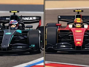
There’s timing to all of this. Red Bull heads into 2026 with a brand-new heartbeat. After ending its title-winning spell with Honda at the conclusion of 2025, the team flips the switch to Red Bull Powertrains in collaboration with Ford — the first full works engine project in its history. The logo refresh is the first public breadcrumb of that new identity, with a more comprehensive reveal to follow at Ford’s season-launch event in Detroit on January 15, where Red Bull and Racing Bulls are expected to lift the covers on their 2026 liveries.
The aesthetic talk will get the headlines, but the technical chatter underneath is louder. Across the paddock, whispers suggest the 2026 Red Bull — internally the RB22 — could debut pushrod suspension front and rear, a package that’s also believed to be on Ferrari’s radar. A double pushrod layout makes sense under the new rules, not just for aero freedom but for how it helps package a very different hybrid unit.
That hybrid is the crux. With the MGU-H gone, vastly increased electrical deployment, and strict energy flow limits, 2026 power units will reward efficiency and clever control as much as outright grunt. Rumors that some manufacturers have found interpretation “opportunities” in the fresh regulations aren’t new — nor are they likely to go away until we hear the first proper dyno sings — but they underline how high the stakes are for a newcomer-works project. Red Bull’s people won’t say it out loud, but their benchmark, as ever, is the metallic three-pointed star and whoever else turns up with a hot lap and a cold face in testing.
There’s also the context of a bruising 2025 campaign. Red Bull finished the year without a title, a rare empty-hands ending in this era, and it stung. The team has never been shy about using disruption as a catalyst, and the Ford era offers a blank sheet: new badgework, new soundtrack, new chance to reassert control of the narrative.
The logo, then, is more than a graphic. It’s a mood board. Red Bull rarely changes anything unless it’s sending a message, and this one reads like intent: the past is an inspiration, not a crutch; the future, very much theirs to define.
What should we expect next? In the short term, noise. The Detroit launch will set the tone visually, and you’d be brave to bet against a gloss finish making at least a cameo. After that, the hard yards: integrating a first-generation power unit with a brand-new aero philosophy while trying not to blink as rivals do exactly the same.
If Red Bull threads that needle, the neat white outline we saw today could end up framing something far more significant come lights out in 2026. If not, it’ll at least look sharp in the photo albums. Either way, the bull’s moving — and it wants you to notice.